New jerseys have given us a lot lately like the Nets to Brooklyn. We’ve had the good in Philly (although those classic, throwback ‘Phila’ jerseys have nothing on the great, vintage, new Milwaukee Bucks unis). The bad in those style shaving Clippers new identities. And now we have the downright ugly…
…ladies and gentlemen, Atlanta gives you their new Hawk uniforms.
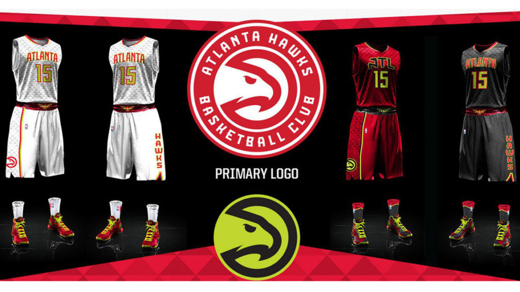
Ugly though in a seemingly garish good way that grows. Just like my Supersonic colorway Air Jordan’s I copped on a recent road trip to Seattle. These new red, white and black, home, road and alternate apparel feature a volt green neon to go with a mix and match option across the range that not only the fans will experiment with when rocking, but the players too.
Honoring the franchises old lime color from the Pistol Pete whipping days, this new court clothing colors some impressive inspiration from the 90’s too. Still these jerseys have a McDonalds All-American feel to them, especially the home uniform. Perhaps a side sponsorship deal is in place with Ronald even if Atlanta is the home if Coca-Cola. Far from amateur though, the white hot home jersey and the slick, black (with new color ‘Georgia Granite Grey’ on their mind) away look is welcome to the city of Atlanta like a Jermaine Dupri and Ludacris half-time show. It’s the torched red ‘ATL’ alternatives (this time no jersey reads Hawks across the chest, true to Atlanta) that are causing some alert though.
And to think bringing Pac (no the old Hawk logo, not legendary rapper. That hash-tag campaign was a tad misguided) back began what was thought to be a classic, new look for these Hawks. Sure, not as bad as they originally look to the eye, these new innovative incarnations have inspiration to them, but the ATL designers have got their talons into some better designs over their always big and bold wardrobe functions. Most notably the last signature set that now tag themselves into the seams of their traditional, throwback stylings. Fans won’t be able to wait for the next Hardwood Classic night now.
These new vibrant vests look to vibe with the young, hip crowd of the city of the A’s scene. Gamers get your 2K Sports ready because these neon jerseys look the ‘Tron’ video game part for the Hawk-eye visual legacy. They’ll also look great when playing the ‘Lights Out’ Lakers at STAPLES. Maybe this team will schedule some blackouts at home for their home court and cloth competitive advantage like high-altitude Denver air and old Boston Garden dead-spots. The triangular meshing design made to resemble the feathers on a Hawk however looks a little like some old 90’s kicks, speaking of ugly sneakers.
With Danny Ferry stepping down and the sale of the Hawks franchise approved, these new jerseys are a colorful distraction to say the least…whether that’s a good or bad thing (repeat the end of the last sentences sentiment). One of last years best NBA teams for their record are already in our face for what they have on-line next year and at least it’s looking different for something the league has never seen before, all the way down to the signature socks. Even if Kyle Korver’s boot cast, fashion accessory on his injury and Kent Bazemore’s rocking of Al Horford’s number 15 jersey made for an unveiling as shockingly eye-catching and maddeningly muddled as these jerseys actually are.
Are you looking forward to Nike taking over the NBA uniform stitching from Adidas now? Sure these controversial colorways are crazy but we’re sure even the old Pac-Man clothed crowd will eat them up like a Georgia peach.


